PlotSet LogoPlotSet

Blogs

Check out these data visualization examples to get inspired

Your Chart Breaks on the Phone (Where Most People Read It)

Jul 1, 2026

Your Chart Breaks on the Phone (Where Most People Read It)

You build charts on a wide desktop and preview them there. But the majority of readers see them on a 360-430px phone, where labels vanish, bars squish, and legends overflow into nonsense.

Read more
The Axis Trick That Made a Pandemic Look Calm

Jun 30, 2026

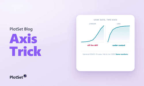
The Axis Trick That Made a Pandemic Look Calm

A logarithmic axis turns explosive growth into a gentle, straight line. The same COVID data on a log versus linear axis tells two opposite stories, and a randomized experiment shows the choice changed how worried people were.

Read more
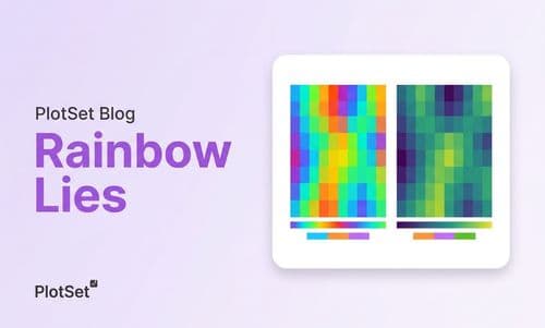
Your Heatmap Is Lying to 300 Million People

Jun 11, 2026

Your Heatmap Is Lying to 300 Million People

Rainbow color maps distort data, invent boundaries, and exclude 300M colorblind viewers. Learn why perceptually uniform scales like viridis fix the problem.

Read more
Nvidia hit $5 trillion in market value today.

Nov 5, 2025

Nvidia hit $5 trillion in market value today.

It's the first company in history to do that. In fact, it added about $300 billion in a day. What happened? Let dig a little. Nvidia announced a $1 billion investment in Nokia to help build AI powered telecommunications infrastructure. The partnership aims to digitalise the global network backbone, embedding AI into 5G and 6G systems that connect the world.

Read more
Creating a Stacked Area Chart: Visualizing U.S. Migration Trends

Sep 27, 2023

Creating a Stacked Area Chart: Visualizing U.S. Migration Trends

Learn how to create a stacked area chart to visualize migration trends in the United States with this informative guide.

Read more
What Is Stacked Area Chart and When to Use It

Sep 27, 2023

What Is Stacked Area Chart and When to Use It

Learn about stacked area charts and their ideal use cases. Discover how this data visualization tool can enhance your presentations and reports.

Read more
Bar Charts 101: A Guide to Creating Compelling Bar Charts

Sep 27, 2023

Bar Charts 101: A Guide to Creating Compelling Bar Charts

Discover the intricacies of crafting a bar chart for your data visualization with our comprehensive guide. Perfect for professionals and beginners alike.

Read more
How to Create a Connected Dots Chart (Revenue Outlook)

Sep 27, 2023

How to Create a Connected Dots Chart (Revenue Outlook)

Discover the process of crafting a Connected Dots visualization showcasing the revenue outlook of leading US companies. Enhance your data visualization skills today.

Read more
How to Create a Population Pyramid (Gym Membership Vs Obesity)

Sep 27, 2023

How to Create a Population Pyramid (Gym Membership Vs Obesity)

Discover the process of crafting a Population Pyramid comparing Gym Membership and Obesity rates. Learn the steps to create this insightful tool.

Read more
Creating a Force-directed Circle Packing (R&D Expenditure)

Sep 27, 2023

Creating a Force-directed Circle Packing (R&D Expenditure)

Discover the process of developing a force-directed circle packing for your data with our comprehensive guide. Enhance your data visualization skills today.

Read more
How to Create an Impressive Spiral Bubble Chart (Miss World Titles by Country)

Sep 27, 2023

How to Create an Impressive Spiral Bubble Chart (Miss World Titles by Country)

Discover the art of crafting a stunning Spiral Bubble for your data with our comprehensive guide. Elevate your presentations today.

Read more
Steps to Creating a Circular Packing (Sunlight Intensity received by the  Planets)

Sep 27, 2023

Steps to Creating a Circular Packing (Sunlight Intensity received by the Planets)

Discover the process of creating a Circle packing to showcase sunlight intensity. Gain valuable insights and knowledge with our step-by-step guide.

Read more